Seeing things from the perspective of the user
One of the things I have really come to appreciate about Apple products (or at least the ones I’ve used) is how intuitive they are.
It’s in the way that the product has solutions you NEVER would have imagined accessing in a smartphone – do you need to quickly measure the length of your cupboard? Just flip out your device! Do you need to scan a document and send it to someone? There’s a feature for that too! Or do you just see your cellphone wish you a good morning each morning, Apple has got you!
The company understands its customer needs indescribably, way beyond the point any customer is able to articulate the need. Apple and the customer have almost become one. This is what enhances the overall customer experience.
That’s how I think about product development.
Product development is about building a product that speaks the ‘same language’ as its user. It’s about saying: Our users are not handymen and women who own a toolkit. But we’ve seen them use makeshift measuring tapes (stacked rulers, and their cellphone) while trying to measure stuff around their houses. So, let’s build a measuring app feature on the app. It’s about building a product that serves the user first. That’s how we build delightful products.
What if we don’t take a user-centered approach?
The Yerkes-Dodson Law of Psychology explains the importance of optimizing tasks when looking to acquire a human’s focused attention. If a task is outside of the scope of the human’s abilities, performance decreases.
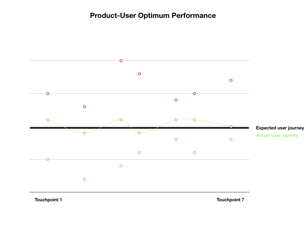
Building features in line with users’ expectations and needs (i.e their mental model) will allow you to optimize the user’s experience. See the image below depicting this idea.

Solid black line: This represents your average user’s expected user journey – what they want to do on your app, the minimum features they expect to see, and where they expect to see them.
Solid green line: This represents the actual user journey existing on your app.
Dotted red dots: all the misses that are outside the user’s expectation or delight.
Optimum performance: The intersection between actual (black) and expected(green).
How to achieve optimum performance
Optimum product performance presupposes the need for user understanding. But, how do you approach learning to see things the way your users see them? Card sorting is one of the methods you can use to achieve this goal.
Card-sorting is a User Experience research method typically used to understand how users expect to find content structured on your website. This research method allows you to “get into the head of the user” and see how they think items should be organized. It allows you to see how the user conducts an activity or looks for an item on your website. Developing the structure of your website the way the user expects it to be structured is one of the ways you can close the gap between your user’s journey and your app journey.
During a card-sorting session, you can ask your users to give you the title for a group of items on your website. This will give you an understanding of the headings and navigation you users expect to see.
Conclusion
Building in accordance with your user’s expected journey is beneficial because you can be sure the user is using this mental model to navigate your website. When you don’t build optimally, you increase the chances of frustration and churn as your user grapples with figuring out your site.
The second way you can close the gap between your user’s expectations and your actual app performance is by managing your user’s expectations. This process is explained in the article: How to manage customer’s expectations.


