Experiences I found on various apps
Zapier’s website architecture is fascinating. There are a number of things to learn from them about how to simplify typically complex processes and improve your website or app’s user experience.
I’ve been using a few apps in the last 6 months.
1. Hubspot, which I’ve found to be extremely hard. So much so that I’ve been using it for more than 6 months but I still can’t say I know what I’m doing half the time. It’s always an exploration while I’m using the app.
2. I’ve also used Zapier. I didn’t think there was anything particularly noteworthy about its architecture while using it. But see, that’s the thing about great websites, you don’t even notice the experience because of just how frictionless it is.
3. I’ve also had the opportunity to use ClickUp. I don’t think I’ve given it enough time to give fair feedback, but I didn’t find it pleasingly easy either.
See, the thing about experience is that whenever I, as the user, need to stop and ask “what’s happening here,” you’ve already lost me. My sigh is an indication that there’s friction in the process that will potentially hinder my overall experience. That’s why it’s necessary to create user-centered websites.
Zapier’s frictionless experience
What can we learn from Zapier about creating seamless, easy processes that users don’t notice?
1. Only display what’s relevant at each moment
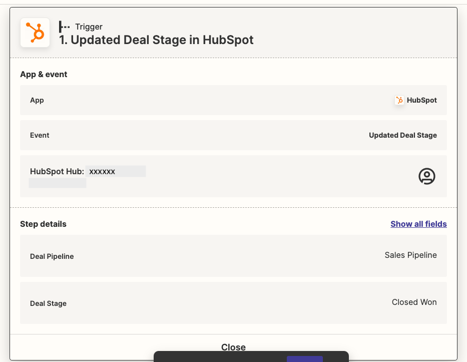
When creating a Zap, only the main headings are displayed on the screen at any one point. In this image, you see the Hubspot trigger and additional requested information about the trigger.
Why is this effective:
It prevents the user from feeling overwhelmed. The user only sees what they have selected at each point, as opposed to a lot of – potentially unnecessary – information.
Display information in a logical order
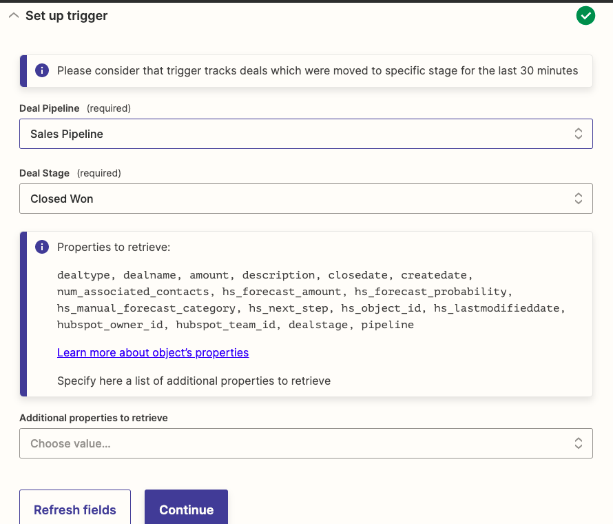
The information displayed follows a similar hierarchy to what the user would expect to see in the affected app (Hubspot in this case). For example, in the example above, the information is displayed so the user selects the pipelines before selecting a specific deal stage in the pipeline.
Why is this effective:
It prevents confusion to the user.
Put users in control of the experience
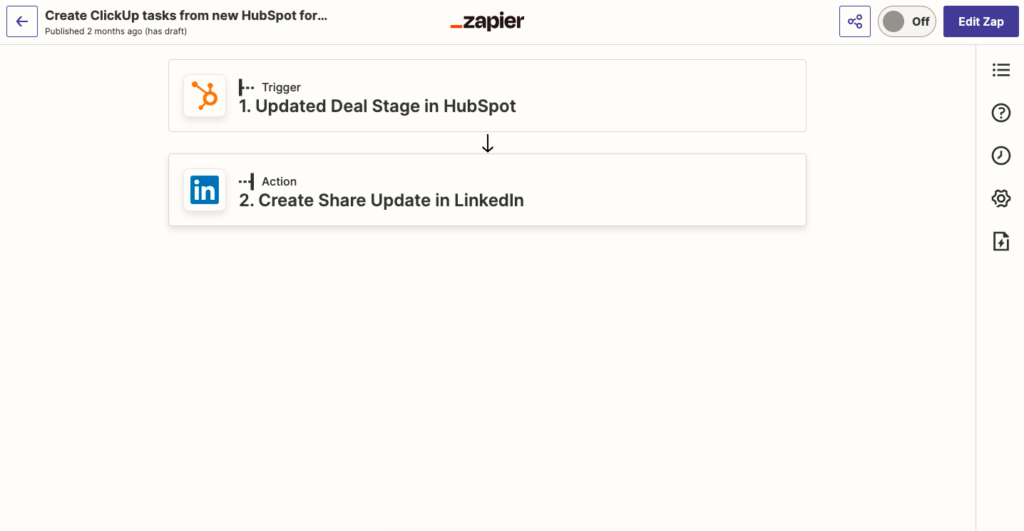
Additional information is only displayed when the user clicks a button to expand the interface.
Why is this effective:
This creates an association between the button clicked and the information displayed at any one point. This gives the user control over what they see, and prevents them from the confusion of seeing unexpected information.



Pingback: How to Decide on the Features to build | Somila Dayile: Customer Delight Manager